|
The analysis worksheet allows you to assess
how any individual consumption varies in
relation to a driving factor. If performance
has been variable, you will be able to
identify periods of good performance and set
targets accordingly for the future. You can
also identify and evaluate periods of
poor performance.
As well as this introductory page, there is a more detailed step-by-step guide to the process of target-setting and analysis. |
|
|
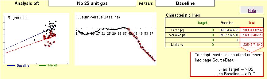
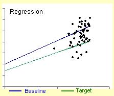
The preview scatter diagram can show two characteristic
lines: the target line (used for overspend reporting)
and a historical baseline against which improvement in
performance is gauged.
A trial line, coloured red, will also be visible if two or more points have been selected for analysis (see below). |
|
|
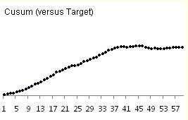
The preview cusum chart shows periods of different
performance (indicated by changes in slope).
Points will be highlighted in red if they have been selected for analysis (see below) |
|
|
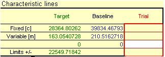
The parameters of the straight lines
on the scatter diagram are shown in a
table, in terms of their intercept (c) and
slope (m). Green numbers
correspond to the green (target) line, and
blue the historical baseline.
Red numbers represent the position of the
trial characteristic line (if present).
The control limit is also shown. |
|
| The last 60 rows of data associated with the selected consumption stream are shown in this table. The rows are numbered for cross-reference with charts. If a driving factor has been associated with it, corresponding values are tabulated. |

|
|
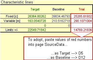
In the 'Characteristic lines' table, the
parameters of the trial regression line
appear in red. Below the table there are
instructions about where to paste copies
of the red numbers in the 'Source Data'
worksheet.
Pasting the values into row 5 of the appropriate column causes the red trial characteristic to become the target for future routine reporting; if pasted into row 12, it is adopted as the historical baseline. |
|
|
In the illustration below, only a baseline characteristic has so far been set (blue line on the
scatter diagram). The cusum chart, plotted against the baseline, has a downward-sloping section
and those points have been selected. The red line on the scatter diagram shows the (improved)
performance that these points represent, and the instructions at bottom right tell the user that by
pasting the red numbers at Cell D5 of the SourceData worksheet, the red characteristic
will become the target for future performance:
| |