
| XSdetect Nano provides four full-screen chart formats which make it easier to see the detail of trends and relationships. They can be captured to the Windows clipboard (using Ctrl-PrtScr) and pasted into documents. | |
|
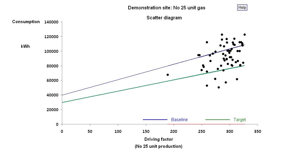
The story starts with the Scatter diagram
which shows the relationship between consumption
and its nominated driving factor (set in row 3
of the
source data worksheet).
If any points have been selected in the analysis sheet, they will be highlighted in red and a red trial characteristic line will be shown (see see example). The illustration shows a green default characteristic line which is only present if non-zero values for c (target) and m (target) have been set in the source data worksheet, rows 5 and 6. It also shows a historical baseline characteristic, which will only be present if non-zero values for c (baseline) and m (baseline) have been set. |
|
| The following charts can be plotted against either the target or the historical baseline characteristic. For simplicity, all are shown relative to the target. | |
|
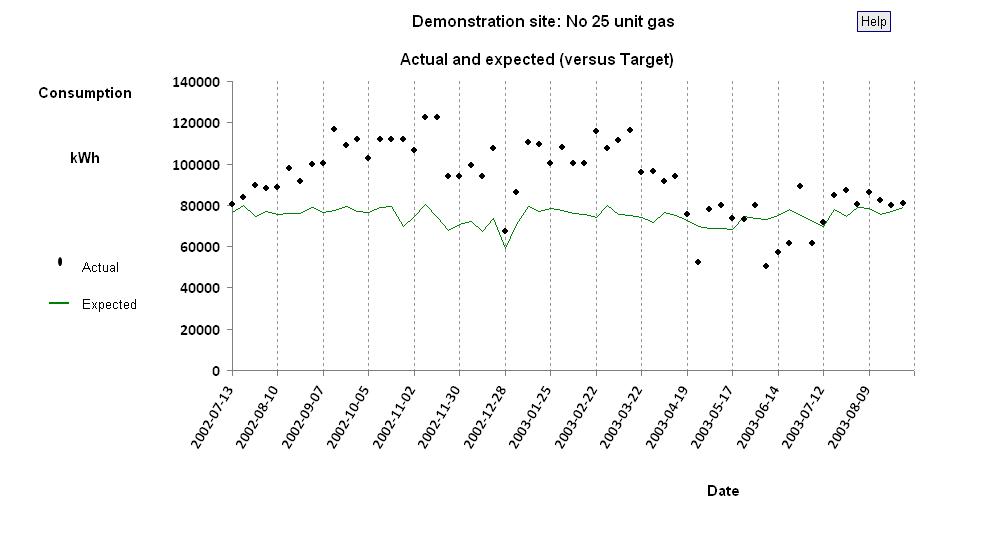
When there is a default characteristic line as illustrated
above, XSdetect Nano can calculate expected consumptions
and these are plotted as a line in the Norm chart,
with actual consumptions represented by individual point
markers.
This chart is useful for demonstrating, to non-expert users, the ability to compare actual with expected consumption in a meaningful way. Again, if particular points are currently selected for analysis, they will appear highlighted in this chart (see example). |
|
|
The Deviation plot shows the history of the
difference between actual and expected consumption.
Currently-selected points will again be highlighted
(see example).
An additional feature on this plot is a pair of dotted red lines, set to represent the typical amount of variation. The position of these control limits is set in row 8 of the source data worksheet. It is automatically recalculated during the analysis process, but its value can be preserved by not altering the entry in the table. |

|
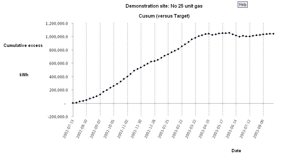
The Cusum chart shows the cumulative sum of the
difference between actual and expected consumption. It
is a critical tool for the analyst and has the following
properties:
|
|