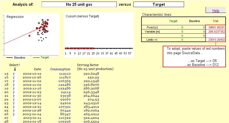
Next, put some text in every cell in the 'Select?' column alongside valid data points. As you do this, the corresponding points are highlighted on the scatter diagram (top left) and a red line will appear, representing the best fit through all the selected points:
Caution: if you select a row containing non-valid data, a best-fit line will not be displayed.
Note also that the small 'Characteristic lines' table (top right) will have numbers in red representing the intercept and slope of the line, and an estimate of the limits of variability.